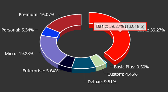
3D Donut Charts
Like Pie Charts, Donut Charts allow you to visualize data groupings (or “slices”) proportional to the whole. Unlike Pie charts, they also allow you to view data for more than one series.
There are two methods for creating Donut Charts:
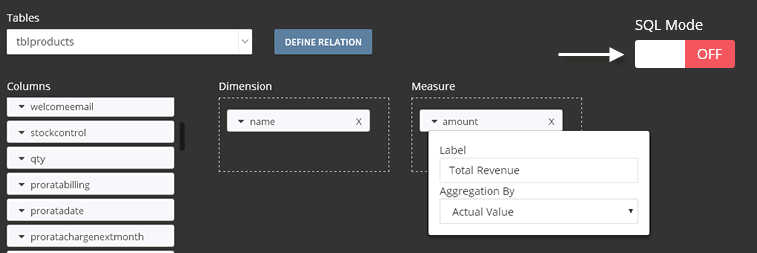
1. Drag and Drop
- Drag one column into the Dimension box
- Drag a numeric column into the Measure box. Numberic column values can be aggregated with functions such as sum, count, average, etc….
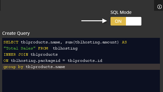
2. SQL Query
Example:
SELECT COL1, COL2 FROM TABLE GROUP BY COL1
In the above SQL query, COL1 is our Dimension column and COL2 is the Numeric or “Measure” column.
SQL mode also provides support for citql tags. citql tags allow you to add interactivity such as filters and other functions.
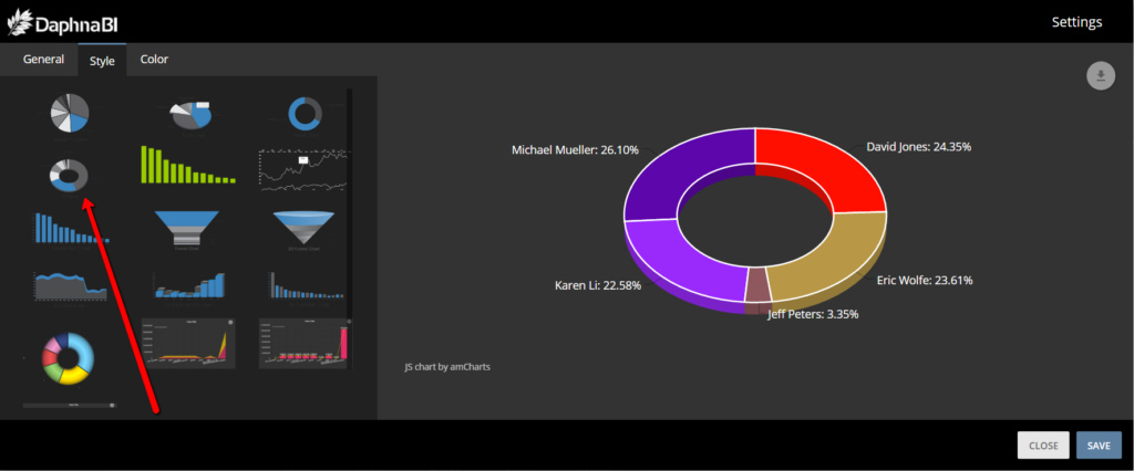
3. Settings
- To access your chart Settings, click on top right corner on the three dots (…)->click on Settings
- The screen below will appear and allow you to set and preview different charts types, customize colors, text, fonts, and other options.